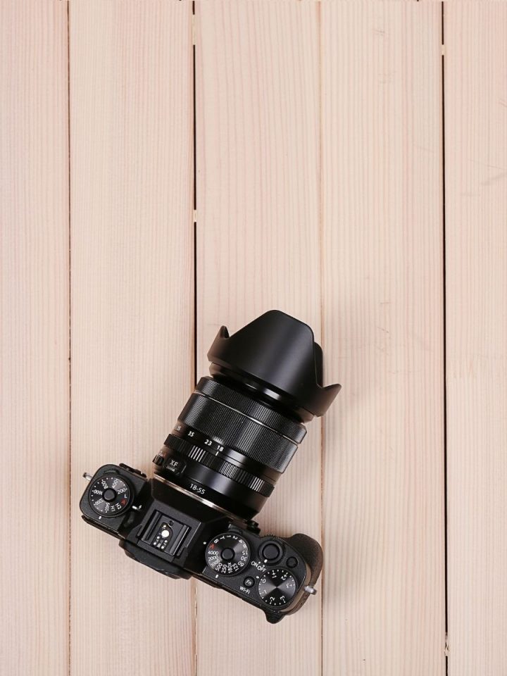
You know those super cool pictures of groups of items or plates of food that are taken from above? Those are called flat lay photos. If you've ever tried to take one yourself, you may find that it's much harder to than it looks to get an Instagram-worthy flat lay!
I recently took a hands-on workshop all about flat lays from the talented Audrey King of French Knot Studios. She's a pro, and it was amazing to watch her work and get her help as we practiced with our own little photoshoots. With her permission, I'm sharing her tips on Photo Styling with you.
Want to take a better flat lay? Check out these tips!
Part One: Think It Through Before You Take Your Pictures.
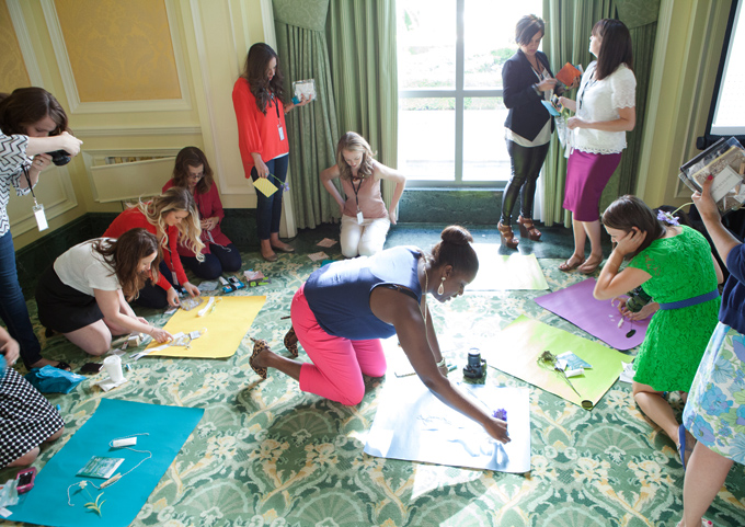
Use Natural Light Whenever Possible
Put simply, natural sunlight is the prettiest and most flattering light for any photography. Since you are probably in a business that appreciates pretty things, you want to use as much natural light as possible.
However, stark, bright sunlight is not the answer, because it comes with harsh, contrasty shadows. Instead, get up close to a window with indirect, soft light, and shoot there. Or go outside in the shade!
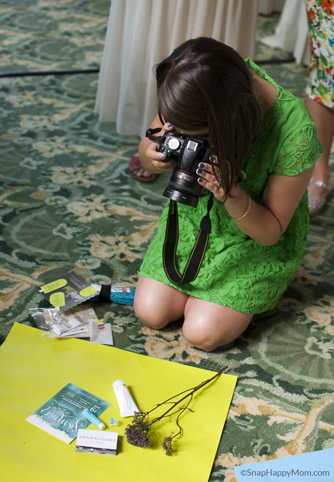
Make Your Own Simple, Convenient Backdrops
Buy a few sheets of foam core, and paint each in a pretty paint sample shade. Label the backs with the shade so you can remember which ones are your favorites, and build up your library of colorful backdrops! You can use poster board as well, but it tends to wrinkle and roll a bit.
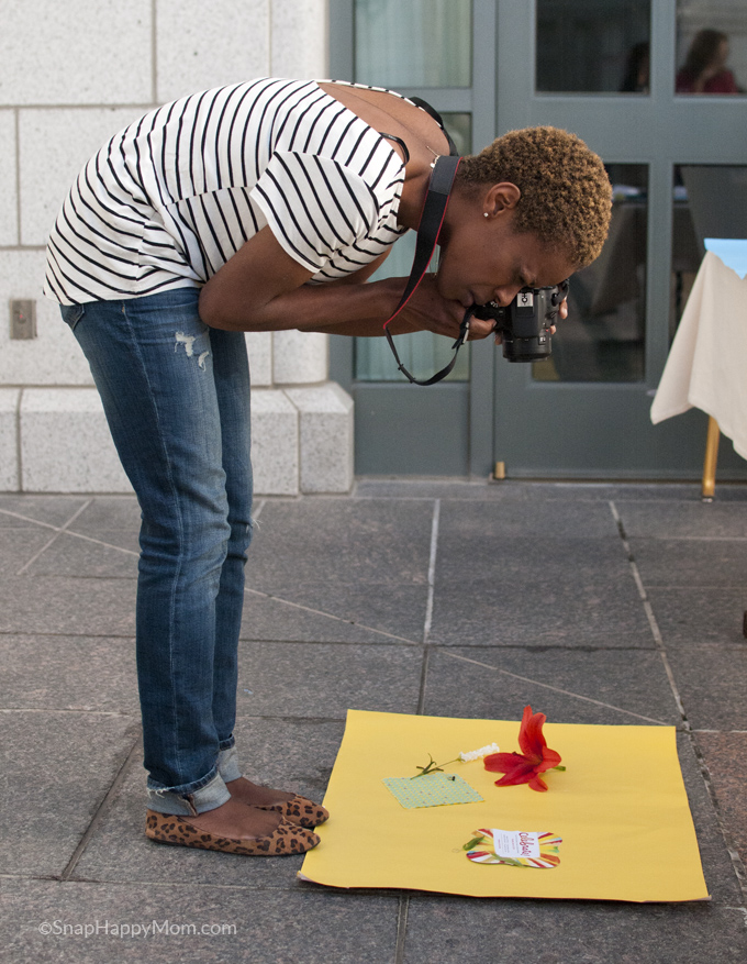
Consider the angle of what you're shooting.
If you're using a colored foam core backdrop, you can either 1) shoot from above, with items laid down on the foam core, or 2) shoot down low from the side, with your foam core serving as a makeshift "wall". Most of the time though, it will be much easier to lay your items on a flat surface and shoot straight down, unless the item you're using doesn't sit well on its side, like a round bowl.
Note: this means that you will probably want to set up your shoot on the ground, especially if you're short! The bigger the items you're shooting, the higher up you'll need to be.
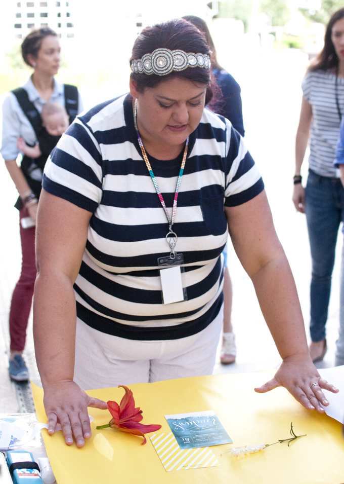
Choose your layout purposefully.
Before you get out the camera, consider where you want to use the photos you are taking. Most magazine and print situations require vertical photos. Most bloggers use horizontal photos in their posts because it allows more space for content above the fold. However, if you're blogging, you'll want to have at least one vertical Pinterest-friendly photo, probably with blank space for a title to be added later.
If you're planning on posting to Instagram, you want to make sure you can crop it to a square without losing information as well. Give yourself room to crop pictures when you’re editing if you're not exactly sure.
Example: In the picture above, you'll notice the horizontal layout framed with Audrey's hands has space on the right side for a title or text. Contrast this to the photo below this paragraph, where a tighter layout works perfectly in a square orientation for Instagram.
Pay attention to 1) how your camera is oriented and 2) how the items in the photo are laid out. If you can take several versions of the same layout with tiny changes, you'll always have the perfect photo for your needs.
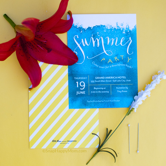
Part Two: The Actual Photo Styling
Photo styling is the art of "designing" items in a photograph to portray certain emotions or messages to the viewer. You want the props/background to be interesting and beautiful, but also not take away from the purpose of the photo.
Audrey explained this in a nutshell: "You instruct the viewer’s eyes where to play!"
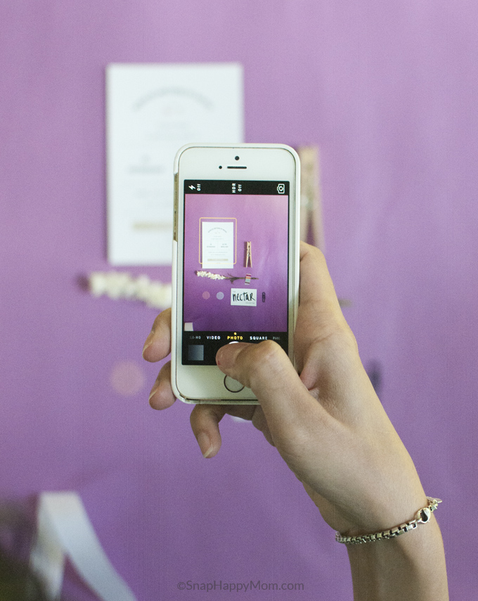
Pay attention to color.
Choose different color values that work well together. (For example, different shades and values of blue look nice together, but neon yellow and goldenrod do not work together.)
The purpose of finding colors that play well together is to provide a balanced image. If everything is the same shade or hue, the viewer doesn't know where to look. You want a good balance between dark and light and everything in between.
A quick way to check this is to take a phone picture and add a black/white filter. You want a good mix between dark black, bright white, and everything in between. If it all looks grey, you need to adjust it.
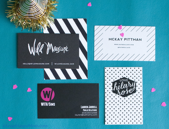
Think About Scale, Alignment, Quantity and Lines.
These little details are worth your attention! This is where you'll make an image interesting, instead of totally forgettable.
Scale: If everything is the same size, you don't know where to look. Instead, you want big and small things in a photo to add interest and indicate importance. Vary the size of things on purpose.
Alignment: Items do not have to be centered in your image, or always facing the direction you expect. Think about the rule of thirds: things that are off-center are much more pleasing to our eye than when something is dead-on centered. You can check this with the gird function on most cameras and even the Instagram app.
Quantity: Odd numbers work really well in photos because it allows for a left-center-right balance. An even number of objects can work if you play around with repetition.
Lines: Also consider the lines that are created by items in your photo: is a prop complimenting or "pointing" to the main focus of the picture? You don't want to draw your reader out of your picture, you want to bring them into the photo and give their eyes something to look at.
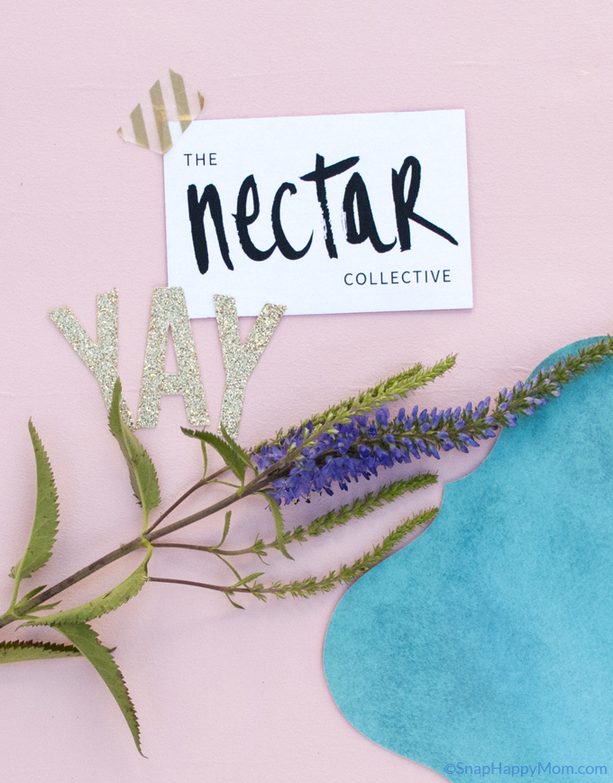
It is totally ok to crop items!
You don’t need to see an entire shirt to get your message across... the cuff and partial sleeve will make someone think "shirt" just the same. Focus on the texture and details of the item, and it will still make sense to the viewer. Many times you can be much tighter than you thought originally.
The exception to this is if you're doing a product shoot for an item you're selling. In that case, make sure you have a full product shot so people completely understand what they are buying. If you can post multiple photos, use the others to focus on the details or the product in use.
Be intentional.
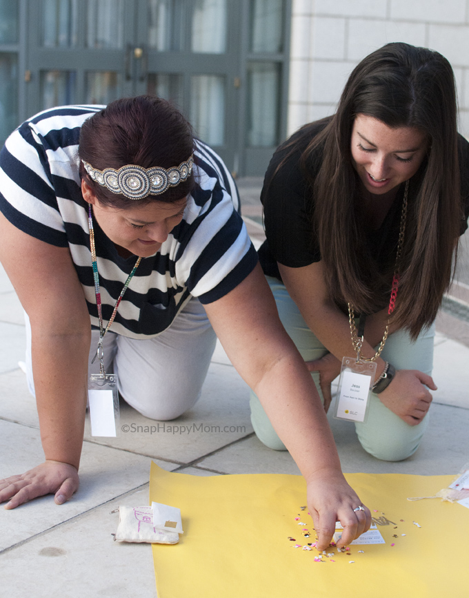
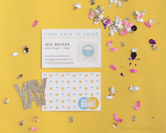
Things that look natural in pictures don't usually just happen. Just plopping items down on the floor doesn't give visually pleasing results, so you're going to have to carefully arrange or place each piece of fabric, ribbon, confetti, and glitter, in addition to whatever items you're actually styling.
And Finally, Two Last Bits of Advice from Audrey
"Take out some information: it could be a pretty beautiful mess."
Once you start taking pictures, you may realize you're carefully planned props look cluttered or overwhelming. Don’t be afraid to take something out! The simpler the styling, to easier it is to focus on what message you're trying to send.
"... And always do your nails for photos!"
Seriously! It's so easy to overlook, but things like this absolutely matter in photo styling.
RECAP
1. Think It Through Before:
-Use natural light whenever possible.
-Make your own simple backdrops.
-Consider the angle of what you are shooting.
-Choose your layout purposefully.
2. The Actual Photo Styling:
-Pay attention to color.
-Think about scale, alignment, quantity, and lines.
-It's ok to crop things.
-Be purposeful.
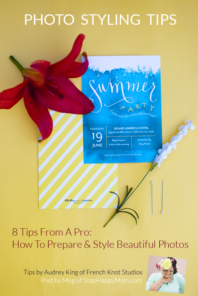
Thanks so much to Audrey from French Knot Studios for teaching this class and giving permission for me to share my notes with you. She's awesome and I seriously adore the stuff I've seen lately from her styling business and her Instagram.



Don says
Great step-by-step instructions! I've got to do more of this!
Alicia says
Great tips! I'll definitely be applying these! I have been working on using natural light as of late and it makes a world of difference in my photos!
JoAnn says
These are beautiful pics! I love the tip about painting the foam core board. Alt Summit seems like such a fantastic time!
JoAnn
Whimsicle
Erica says
Thanks for putting together these tips. You captured them perfectly and reminded me of a few I had forgotten!
Sarah says
Thank you so much for posting all the recaps and tips you learned from alt Summit! I've never been to a conference and I love hearing all about them. Your photos look great and the tips are fantastic!